06 Differential expression analysis
Overview
Teaching: 30 min
Exercises: 60 minQuestions
What are factor levels and why is it important for different expression analysis?
How can I call the genes differentially regulated in response to my experimental design?
What is a volcano plot and how can I create one?
What is a heatmap and how can it be informative for my comparison of interest?
Objectives
Be able to specify the correct experimental conditions (contrast) that you want to compare.
Be able to call differentially expressed genes for conditions of interest.
Be able to create volcano plot and heatmap figures to visualise genes that are differentially expressed.
Table of Contents
- 1. Introduction
- 2. Differential expression analysis
- 3. Volcano plot
- 4. Heatmap
- Bonus: MA plots
- References
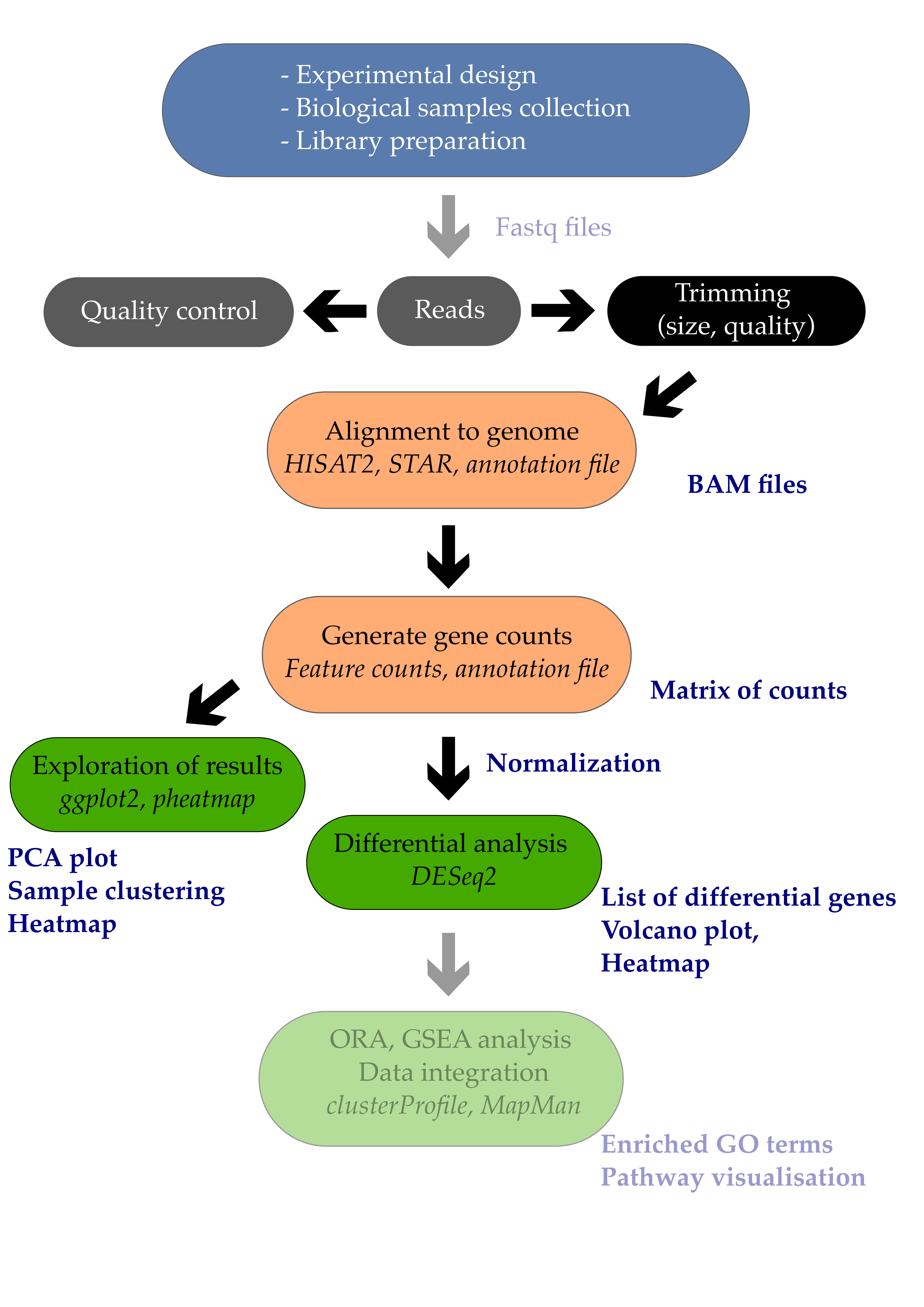
1. Introduction
Differential expression analysis is the process of determining which of the genes are significantly affected by my experimental design. In the example study that we use, Arabidopsis plants were infected or not by a pathogenic bacteria called Pseudomonas syringae DC3000. One comparison of interest could be to determine which of the Arabidopsis leaf genes are transcriptionally affected by the infection with this pathogenic bacteria.
In this episode, we will see how to perform a simple one-condition experimental comparison with DESeq2. We will compare the transcriptome of Arabidopsis in response to infection by the leaf pathogenic bacteria Pseudomonas syringae DC3000 after 7 days (7 dpi).
This will yield a table containing genes \(log_{2}\) fold change and their corrected p-values. We will also see how to create a few typical representations classically used to display RNA-seq results such as volcano plots and heatmaps.
Important note
For differential expression analysis, you should use the raw counts and not the scaled counts. As the DESeq2 model fit requires raw counts (integers), make sure that you use the
counts.csvfile.
2. Differential expression analysis
2.1 Creating the DESeqDataSet object
Since we do not want to work on all comparisons, we will filter out the samples and conditions that we do not need. Only the mock growth and the P. syringae infected condition will remain.
# Import libraries
library(DESeq2)
library(EnhancedVolcano)
library(tidyverse)
library(apeglm)
library(pheatmap)

# BiocManager::install('apeglm')

# import the samples to conditions correspodence
xp_design <- read_csv("tutorial/samples_to_conditions.csv")

# filter design file to keep only "mock" and the "infected P. syringae at 7 dpi" conditions.
xp_design_mock_vs_infected <- xp_design %>%
                                filter(growth == "MgCl2" & dpi == "7")
We then import the gene counting values and call it raw_counts.
The gene names have to be changed to the names of the rows of the table for compatibility with DESeq2. This is done using the column_to_rownames() function from the tibble package (contained in tidyverse suite of packages).
# Import the gene raw counts
raw_counts <- read_csv("tutorial/raw_counts.csv") %>%
                column_to_rownames("Geneid")

# reorder counts columns according to the complete list of samples
raw_counts <- raw_counts[ , xp_design$sample]
We will now filter both the raw_counts and xp_design objects to keep a one-factor comparison and investigate the leaf transcriptome
of Arabidopsis plants whose seeds were MgCl2 treated and whose plants were infected or not with Pseudomonas syringae DC3000 at 7 dpi.
The corresponding code is available below.
# Filter count file accordingly (to keep only samples present in the filtered xp_design file)
raw_counts_filtered = raw_counts[, colnames(raw_counts) %in% xp_design_mock_vs_infected$sample]

## Creation of the DESeqDataSet
dds <- DESeqDataSetFromMatrix(countData = raw_counts_filtered,
                              colData   = xp_design_mock_vs_infected,
                              design    = ~ infected)
You can have a glimpse at the DESeqDataSet dds object that you have created. It gives some useful information already.
dds
class: DESeqDataSet
dim: 33768 8
metadata(1): version
assays(1): counts
rownames(33768): AT1G01010 AT1G01020 ... ATMG01400 ATMG01410
rowData names(0):
colnames(8): ERR1406305 ERR1406306 ... ERR1406265 ERR1406266
colData names(4): sample growth infected dpi
Important note on factor levels
It is important to make sure that levels are properly ordered so we are indeed using the mock group as our reference level. A positive gene fold change means that the gene is upregulated in the P. syringae condition relatively to the mock condition.
Please consult the dedicated section of the DESeq2 vignette on factor levels.
One way to see how levels are interpreted within the DESeqDataSet object is to display the factor levels.
dds$infected
[1] mock  mock  mock  mock  Pseudomonas_syringae_DC3000
[6] Pseudomonas_syringae_DC3000 Pseudomonas_syringae_DC3000 Pseudomonas_syringae_DC3000
Levels: mock Pseudomonas_syringae_DC3000
This shows that the mock level comes first before the Pseudomonas_syringae_DC3000 level. If this is not correct, you can change it following the dedicated section of the DESeq2 vignette on factor levels.
2.2 Running the DE analysis
Differential gene expression analysis will consist of simply two lines of code:
- The first will call the
DESeqfunction on aDESeqDataSetobject that you’ve just created under the namedds. It will be returned under the sameRobject namedds. - Then, results are extracted using the
resultsfunction on theddsobject and results will be extracted as a table under the nameres(short for results).
dds <- DESeq(dds)
estimating size factors
estimating dispersions
gene-wise dispersion estimates
mean-dispersion relationship
final dispersion estimates
fitting model and testing
res <- results(dds)

# have a peek at the DESeqResults object
res
The theory beyond DESeq2 differential gene expression analysis is beyond this course but nicely explained within the DESeq2 vignette.
Beware of factor levels
If you do not supply any values to the contrast argument of the
DESeqfunction, it will use the first value of the design variable from the design file.In our case, we will perform a differential expression analysis between
mockandPseudomonas_syringae_DC3000.
- Which of these two is going to be used as the reference level?
- How would you interpret a positive log2 fold change for a given gene?
Solution
- The
mockcondition is going to be used as the reference level since m frommockcomes beforePfromPseudomonas_syringae_DC3000.- A positive log2 fold change for a gene would mean that this gene is more abundant in
Pseudomonas_syringae_DC3000than in themockcondition.
The complete explanation comes from the DESeq2 vignette:
Results tables are generated using the function results, which extracts a results table with log2 fold changes, p values and adjusted p values. With no additional arguments to results, the log2 fold change and Wald test p value will be for the last variable in the design formula, and if this is a factor, the comparison will be the last level of this variable over the reference level (see previous note on factor levels). However, the order of the variables of the design do not matter so long as the user specifies the comparison to build a results table for, using the name or contrast arguments of results.
A possible preferred way is to specify the comparison of interest explicitly. We are going to name this new result object all_genes_results and compare it with the previous one called res.
all_genes_results <- results(dds, contrast = c("infected",                      # name of the factor
                                  "Pseudomonas_syringae_DC3000",    # name of the numerator level for fold change
                                  "mock"))                          # name of the denominator level
If we now compare the res and all_genes_results DESeqResults objects, they should be exactly the same and return a TRUE value.
all_equal(res, all_genes_results)
If not, that means that you should check your factor ordering.
2.3 Extracting the table of differential genes
We can now have a look at the result table that contains all information on all genes (p-value, fold changes, etc).
Let’s take a peek at the first lines.
head(all_genes_results)
log2 fold change (MLE): infected Pseudomonas_syringae_DC3000 vs mock
Wald test p-value: infected Pseudomonas syringae DC3000 vs mock
DataFrame with 33768 rows and 6 columns
                   baseMean     log2FoldChange             lfcSE              stat               pvalue                 padj
                  <numeric>          <numeric>         <numeric>         <numeric>            <numeric>            <numeric>
AT1G01010  87.4202637575253 -0.367280333820308 0.211701693868572 -1.73489558401135   0.0827593014886041    0.187224259459075
AT1G01020  477.153016520262 -0.266372165020665 0.107897663309171 -2.46874822726606     0.01355865776731   0.0457278114202934
AT1G03987  14.6179093243162  -1.47071320232473 0.462672694746205 -3.17873351729018   0.0014792001454695  0.00740168146185112
AT1G01030  194.095081900871 -0.916622750549647 0.276959201424051 -3.30959486392441 0.000934310992084711   0.0050664498722226
AT1G03993  175.982458997999  0.108469082280126 0.142106475509239 0.763294437438034    0.445287818744395    0.614000180781882
...                     ...                ...               ...               ...                  ...                  ...
ATMG01370  83.9769196075523 -0.825187944843753 0.216251457067068 -3.81587229993937 0.000135702676638565 0.000983812944421723
ATMG01380  57.1084095053476 -0.589800569274135 0.260988059519601 -2.25987568304764   0.0238289675115254   0.0709844754284016
ATMG01390  1085.66028395293  0.429149247175392 0.443108924164171 0.968496059935803    0.332796685814142    0.507053899330804
ATMG01400 0.254714460748876 -0.411354295725567   3.5338115409304 -0.11640527259619    0.907331356876165                   NA
ATMG01410  7.79228297186529 -0.957658947213795 0.619376215569985 -1.54616680967076    0.122064287011553      0.2498275349753
Question
- What is the biological meaning of a \(log2\) fold change equal to 1 for gene X?
- What is the biological meaning of a \(log2\) fold change equal to -1?
- In R, compute the \(log2\) fold change (“treated vs untreated”) of a gene that has:
- A gene expression equal to 230 in the “untreated” condition.
- A gene expression equal to 750 in the “treated” condition.
Solution
- A \(log2\) equal to 1 means that gene X has a higher expression (x2, two-fold) in the DC3000 infected condition compared to the mock condition.
- A \(log2\) equal to -1 means that gene X has a smaller expression (\(\frac{1}{2}\)) in the DC3000 infected condition.
untreated = 230
treated = 750
log2(treated/untreated) # equals 1.705257
Some explanations about this output:
The results table when printed will provide the information about the comparison, e.g. “log2 fold change (MAP): condition treated vs untreated”, meaning that the estimates are of log2(treated / untreated), as would be returned by contrast=c(“condition”,”treated”,”untreated”).
So in our case, since we specified contrast = c("infected", "Pseudomonas_syringae_DC3000", "mock"), the log2FoldChange will return the \(log2(Pseudomonas \space syringae \space DC3000 \space / \space mock)\).
Additional information on the DESeqResult columns is available using the mcols function.
mcols(all_genes_results)
This will indicate a few useful metadata information about our results:
DataFrame with 6 rows and 2 columns
                       type                                                          description
                <character>                                                          <character>
baseMean       intermediate                            mean of normalized counts for all samples
log2FoldChange      results log2 fold change (MLE): infected Pseudomonas_syringae_DC3000 vs mock
lfcSE               results         standard error: infected Pseudomonas syringae DC3000 vs mock
stat                results         Wald statistic: infected Pseudomonas syringae DC3000 vs mock
pvalue              results      Wald test p-value: infected Pseudomonas syringae DC3000 vs mock
padj                results                                                 BH adjusted p-values
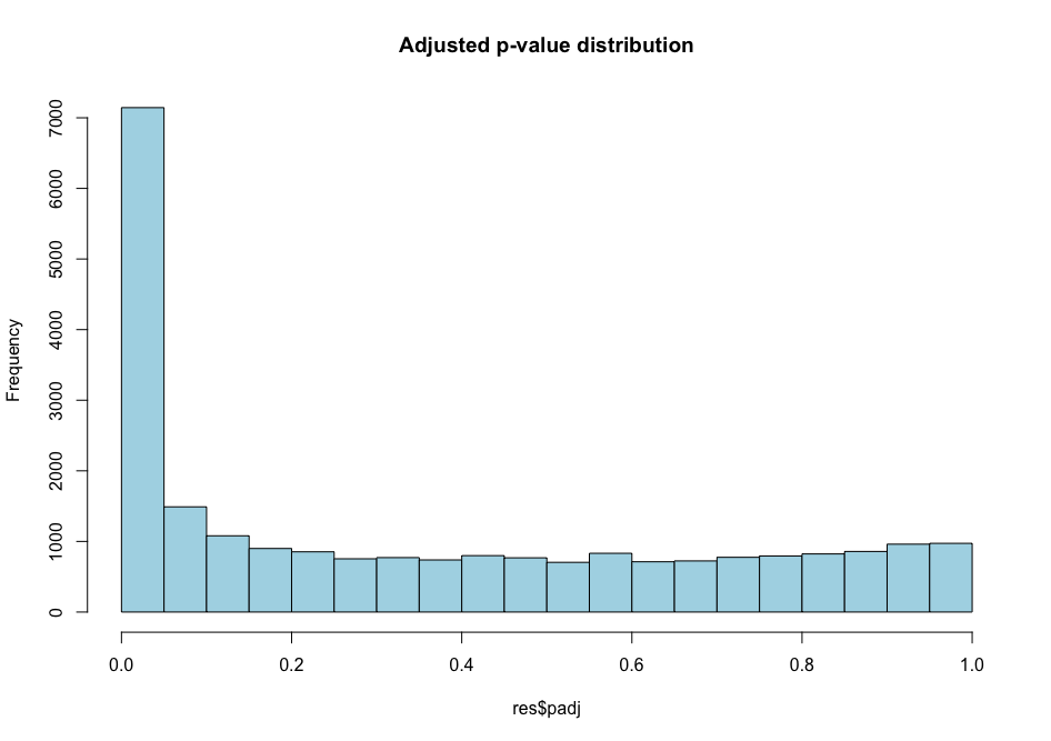
2.4 False discovery rates
The selected \(\alpha\) threshold controls for type I error rate: rejecting the null hypothesis (H0 no difference) and therefore affirming that there is a gene expression difference between conditions while there aren’t any. This \(\alpha\) value is often set at at \(\alpha\) = 0.01 (1%) or \(\alpha\) = 0.001 (0.1%) in RNA-seq analyses.
When you perform thousands of statistical tests (one for each gene), you will by chance call genes differentially expressed while they are not (false positives). You can control for this by applying certain statistical procedures called multiple hypothesis test correction.
We can count the number of genes that are differentially regulated at a certain \(\alpha\) level.
# threshold of p = 0.01
all_genes_results %>%
  as.data.frame() %>%
  filter(padj < 0.01) %>%
  nrow()

# threshold of p = 0.001
all_genes_results %>%
  as.data.frame() %>%
  filter(padj < 0.001) %>%
  nrow()
You should obtain 4979 differentially expressed genes at 0.01 and 3249 at 0.001 which are quite important numbers: indeed, it corresponds to respectively ~15% and ~10% of the whole number transcriptome (total number of mRNA is 33,768).
Histogram p-values This blog post explains in detail what you can expect from each p-value distribution profile.
# distribution of adjusted p-values
hist(all_genes_results$padj, col = "lightblue", main = "Adjusted p-value distribution")
# distribution of non-adjusted p-values
hist(all_genes_results$pvalue, col = "grey", main = "Non-adjusted p-value distribution")
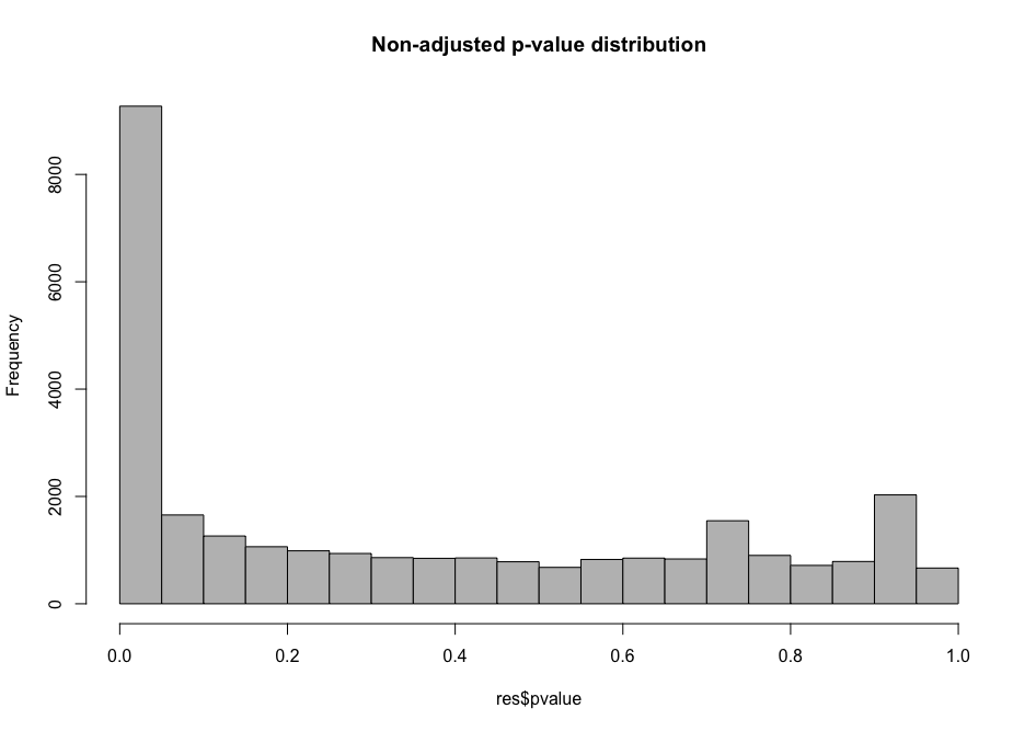
As you can see, the distribution of p-values was already quite similar suggesting that a good proportion of the tests have a significant p-value (inferior to \(\alpha\) = 0.01 for instance). This suggests that a good proportion of these will be true positives (genes truly differentially regulated).
Extracting the table of differential genes
Ok, here’s the moment you’ve been waiting for. How can I extract a nicely filtered final table of differential genes? Here it is!
diff_genes = all_genes_results %>%
               as.data.frame() %>%
               rownames_to_column("genes") %>%
               filter(padj < 0.01) %>%
               arrange(desc(log2FoldChange), desc(padj))
head(diff_genes)
Choosing thresholds
Getting a list of differentially expressed genes means that you need to choose an absolute threshold for the log2 fold change (column
log2FoldChange) and the adjusted p-value (column_padj_). Therefore you can make different list of differential genes based on your selected thresholds. It is common to choose a log2 fold change threshold of |1| or |2| and an adjusted p-value of 0.01 for instance.
You could write this file on your disk with write.csv() for instance to save a comma-separated text file containing your results.
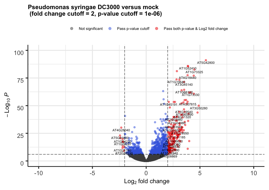
3. Volcano plot
For each gene, this plot shows the gene fold change on the x-axis against the p-value plotted on the y-axis.
Here, we make use of a library called EnhancedVolcano which is available through Bioconductor and described extensively on its own GitHub page.
First, we are going to “shrink” the \(\log2\) fold changes to remove the noise associated with fold changes coming from genes with low count levels. Shrinkage of effect size (LFC estimates) is useful for visualization and ranking of genes. This helps to get more meaningful log2 fold changes for all genes independently of their expression level.
Which
the name or number of the coefficient (LFC) to shrink
resLFC <- lfcShrink(dds = dds,
                    res = all_genes_results,
                    type = "apeglm",
                    coef = "infected_Pseudomonas_syringae_DC3000_vs_mock") # name or number of the coefficient (LFC) to shrink
To see what coefficients can be extracted, type:
resultsNames(dds)
[1] "Intercept"
[2] "infected_Pseudomonas_syringae_DC3000_vs_mock"
We can build the Volcano plot rapidly without much customization.
# The main function is named after the package
EnhancedVolcano(toptable = resLFC,      # Use the shrunken log2 fold change to remove noise associated with low count genes.
                x        = "log2FoldChange",   # Name of the column in resLFC that contains the log2 fold changes
                y        = "padj",             # Name of the column in resLFC that contains the p-value
                lab      = rownames(resLFC))
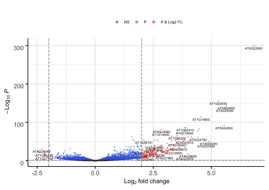
Alternatively, the plot can be heavily customized to become a publication-grade figure.
EnhancedVolcano(toptable = resLFC,
                x        = "log2FoldChange",
                y        = "padj",
                lab      = rownames(resLFC),
                xlim     = c(-10, +10),
                ylim     = c(0,100),
                pCutoff  = 1e-06,,
                FCcutoff = 2,
                title = "Pseudomonas syringae DC3000 versus mock \n (fold change cutoff = 2, p-value cutoff = 1e-06)",
                legendLabels = c(
                  'Not significant',
                  'Log2 fold-change (but do not pass p-value cutoff)',
                  'Pass p-value cutoff',
                  'Pass both p-value & Log2 fold change')
                )
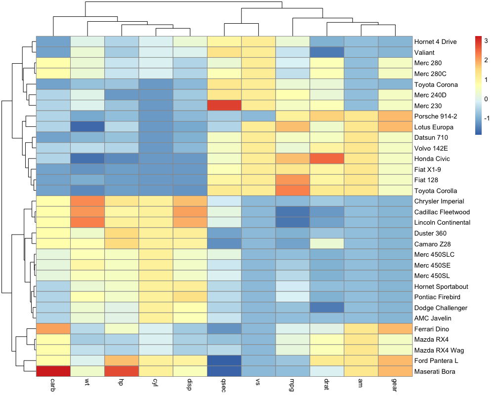
4. Heatmap
A heatmap is a representation where values are represented on a color scale. It is usually one of the classic figures part of a transcriptomic study. One can also cluster samples and genes to identify groups of genes that show a coordinated behaviour. Let’s build a nice looking heatmap to display our differential genes one step at a time.
We are going to make use of a library called pheatmap. Here is a minimal example (mtcars is a dataset that comes included with R).
df <- scale(mtcars)
pheatmap(df)
Troubleshooting
If you have issues where your heatmap plot is not being shown, run
dev.off()and try to plot again. It should solve your issue.
4.1 Heatmap using raw counts
When making a heatmap, it is best to use normalized counts. However, in order to show you the difference between using normalized and unnormalized counts, we will start with the raw_counts object that contains the unnormalized counts for our genes. We will focus on the differentially expressed genes identified above.
Let’s look at a histogram of the row means of each gene in raw_counts.
raw_counts %>%
  filter(rownames(raw_counts) %in% diff_genes$genes) %>%
  mutate(rm = rowMeans(.)) %>%
  select(rm) %>%
  ggplot(aes(rm)) +
    geom_histogram() +
    labs(title = "Histogram of DE Gene Row Means")
TBD: Insert image of plot.
As you can see, most of the reads have low values and a few have high values. This will be reflected in the heatmap that we create.
Use the pheatmap function to create a heatmap using the raw counts.
raw_counts %>%
  filter(rownames(raw_counts) %in% diff_genes$genes) %>%
  pheatmap(show_rownames = FALSE)
TBD: Insert image of plot.
We have removed the genes names with show_rownames = FALSE since they are not readable anymore for such a high number of genes.
The heatmap is a type of tile plot, in which each tile (or rectangle) represents the expression of one gene in one sample. The samples are listed along the X-axis and the genes are listed along the Y-axis. Each axis also contains a dendrogram, which is a tree that shows the clustering order of the sample (or genes).
As you can see, most of the genes have low values and the coloring of the plot is dominated by the highly expressed genes in red.
4.2 Heatmap using normalized counts
Next, we will get the normalized counts using the variance stabilizing transform (vst). Normalizing the counts will help to make the heatmap more useful.
First, we will get the vst normalized genes and will filter them to retain the differentially expressed genes.
vst_expr <- varianceStabilizingTransformation(dds) %>%
            assay() %>%
            as.data.frame() %>%
            filter(rownames(.) %in% diff_genes$genes)
dim(vst_expr)
We now have 4979 genes (rows, p < 0.01) and 48 samples (columns) which correspond to the number of differential genes identified previously between Mock and DC3000 infected conditions at 7 dpi and with a MgCl2 seed coating. You can also use head() to show the first lines of this table.
Let’s create a heatmap using the normalized counts.
pheatmap(mat           = vst_expr,
         scale         = "none",
         show_rownames = FALSE)
TBD: Insert image of plot.
Note that this time, we used the argument “scale = ‘none’”. This is the default setting and it turns off row and column scaling. The heatmap looks a little better this time because we can see different expressino levels better.
Although the scaling has been slightly improved it is still not really an optimal heatmap.
4.3 Heatmap using normalized counts with scaling
When creating a heatmap, it is vital to control how scaling is performed. A possible solution is to specify scale = "row" to the pheatmap() function to perform row scaling since gene expression levels will become comparable. This will perform a Z-score calculation for each gene so that \(Z = {x - \mu \over \sigma}\) where \(x\) is an individual gene count inside a given sample, \(\mu\) the row mean of for that gene across all samples and \(\sigma\) its standard deviation.
Check background and R code instructions here.
For each gene, the row-wise mean should be close to 0 while the row-wise standard deviation should be close to 1. We are going to use the R scale() function to do this and check that our scaling procedure worked out.
Does this scaling improves our heatmap?
pheatmap(mat           = vst_expr,
         show_rownames = FALSE,
         scale         = "row")
TBD: Insert image of plot.
Notice
Have you noticed the two different color scales?
This plot is easier to interpret. Genes with similar profiles that distinguish different samples can be easily visualised. We can see that the two sets of samples cluster together on the X-axis. And the genes are now clustered by thier correlation with each other. Since we filtered the genes to select ones which are differentially expressed, we can see two broad clusters of genes: one that are up- or down-regulated in the two samples groups.
The last thing that we can do is to add sample annotation to the plot. To do this, we need to create a sample annotation data.frame. We will use the ‘xp_design_mock_vs_infected’ data.frame to provide sample annotation. We must first set the rownames equal to the sample IDs. Then we will pass this into the ‘annotation_col’ argument, which accepts a data.frame to use for column annotation.
sample_annot = xp_design_mock_vs_infected %>%
                 column_to_rownames('sample')
pheatmap(mat            = vst_expr,
         show_rownames  = FALSE,
         scale          = "row",
         annotation_col = sample_annot)
Question
Do you know how this gene and sample clustering was done? How can you find this out?
Solution
Check in the help page related to the
pheatmapfunction (type?pheatmap) inside R. By default, the clustering distance is euclidean for both rows (genes) and columns (samples). The clustering_method is complete.
You can change this default behavior easily and try other clustering methods (see ?hclust for supported methods).
Discussion
The gene clusters do not seem to be pretty clear cut though. Do you have an idea why?
Hint: we still have 48 samples under investigation but we are working on 4979 genes (differential genes between what?)
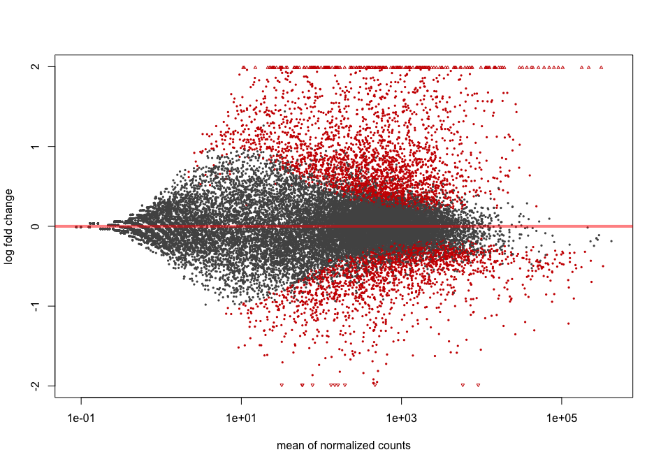
Bonus: MA plots
We don’t cover MA plots in this lesson but if you are interested, you can have a look at it here.
The MA plot originally comes from microarray studies that compared two conditions. From the DESeq2 vignette:
In DESeq2, the function
plotMAshows the log2 fold changes attributable to a given variable over the mean of normalized counts for all the samples in the DESeqDataSet. Points will be colored red if the adjusted p value is less than 0.1. Points which fall out of the window are plotted as open triangles pointing either up or down.
plotMA(dds2, alpha = 0.01)
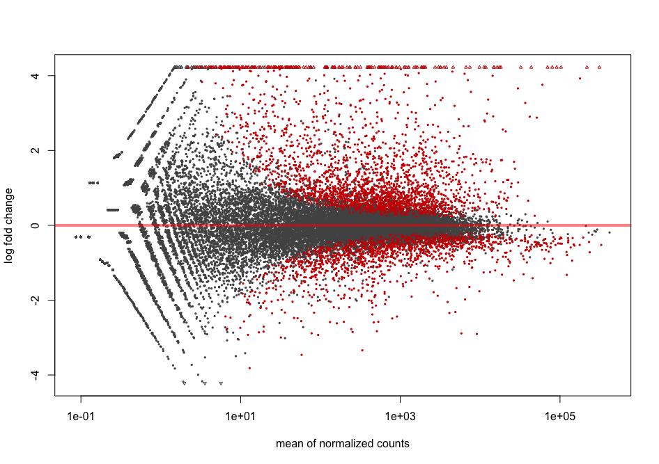
Shrinkage of effect size (LFC estimates) is useful for visualization and ranking of genes. It is more useful visualize the MA-plot for the shrunken log2 fold changes, which remove the noise associated with log2 fold changes from low count genes without requiring arbitrary filtering thresholds. This helps to get more meaningful log2 fold changes for all genes independently of their expression level.
resLFC <- lfcShrink(dds = dds2,
                  res = res,
                  type = "normal",
                  coef = 2) # corresponds to "infected_Pseudomonas_syringae_DC3000_vs_mock" comparison
plotMA(resLFC, alpha = 0.01)
You can see that genes with low counts are now shrinked.
References
- Kamil Slowikoski blog post about heatmap
- Z-score calculations: link 1 and link 2.
- Type I and type II error rates in gene expression studies
- p-value histograms explained
Key Points
Call differentially expressed genes requires to know how to specify the right contrast.
Multiple hypothesis testing correction is required because multiple statistical tests are being run simultaneously.
Volcano plots and heatmaps are useful representations to visualise differentially expressed genes.